
Los Angeles Public Library: UX Proposal
Role: Project Lead + Designer
CATEGORIES: UX, interaction, design research
KEYWORDS: public libraries, public resources, public services, cultural institutions
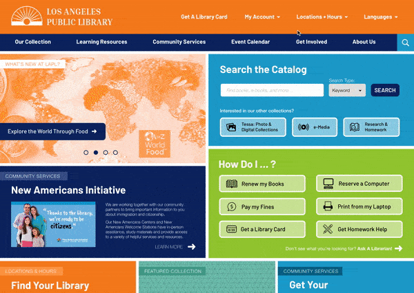
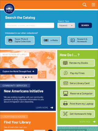
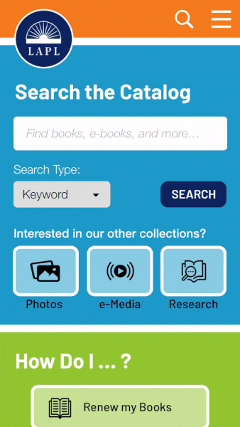
I redesigned the Los Angeles Public Library’s (LAPL) homepage and the LAPL To Go mobile app to focus on making the Library’s wealth of resources and services more discoverable for their users.
This project is not sponsored or endorsed by LAPL.

PROCESS
Phase 01A: DEVELOPING A SURVEY
If you have ever used the Los Angeles Public Library’s resources, please take a few minutes to fill out this preliminary survey to help me with this project!
Phase 01B: LAPL’s STRATEGIC PLAN
Knowing that I might not get as much survey participation as I wanted, I turned to the work LAPL has already done in outlining their 5-year strategic plan for 2015-2020. In it they outline 6 major goals for their patrons, and for how the Library can contribute to the communities of Los Angeles.

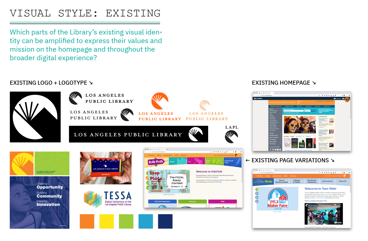
Phase 02A: DECONSTRUCTING LAPL’s EXISTING DIGITAL USER EXPERIENCE


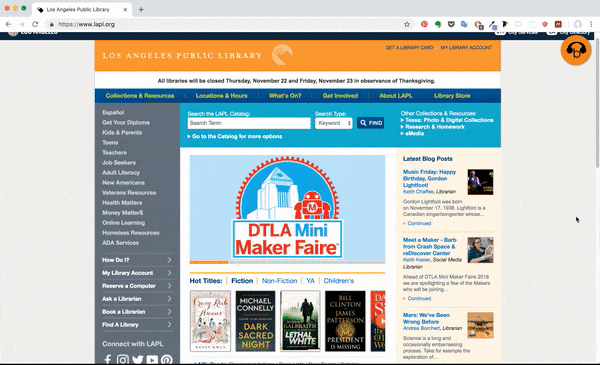
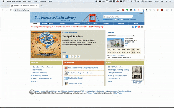
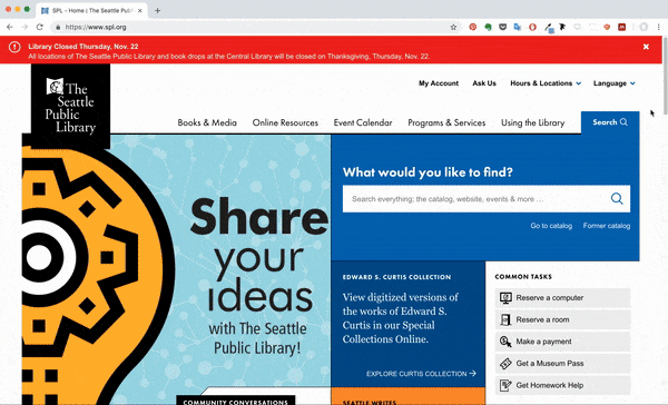
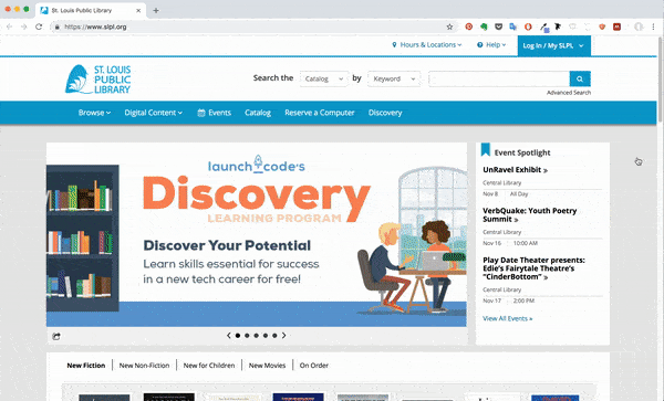
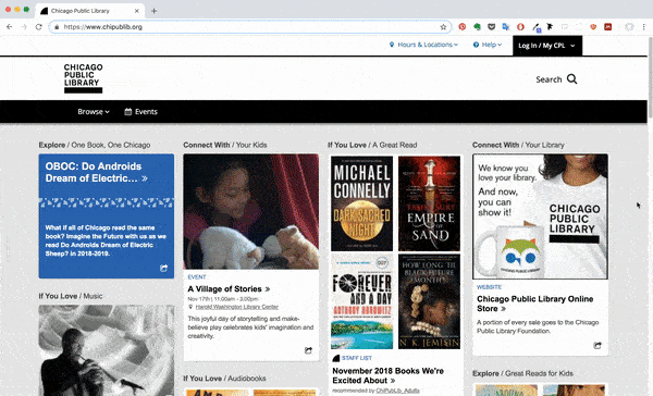
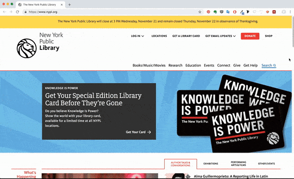
PHASE 02B: HOW DOES LAPL’s HOMEPAGE COMPARE TO OTHER PUBLIC LIBRARIES?
To get a better sense of what the public library digital landscape is like, I compared LAPL’s homepage experience to that of the public libraries in five other major U.S. cities. Some insights from this comparison were:
- Each library’s Updates are most often put front and center, followed by Catalog Search / Search.
- Imagery and icons are used to break up the amount of textual information on the page.
- The two midwestern libraries’ (Saint Louis & Chicago) sites were both built using Bibliocommons software, and have some common page structures as a result. This software also powers the catalog of the Seattle Public Library.
- Seattle’s use of a responsive header allows the menu to stay in view while exploring other content on the homepage, which helps to avoid getting lost in all of the available information on the page.
- San Francisco’s small page outlay + dropdown menu navigation isn’t very “up-to-date”, however, it makes the different avenues of information easy to digest.
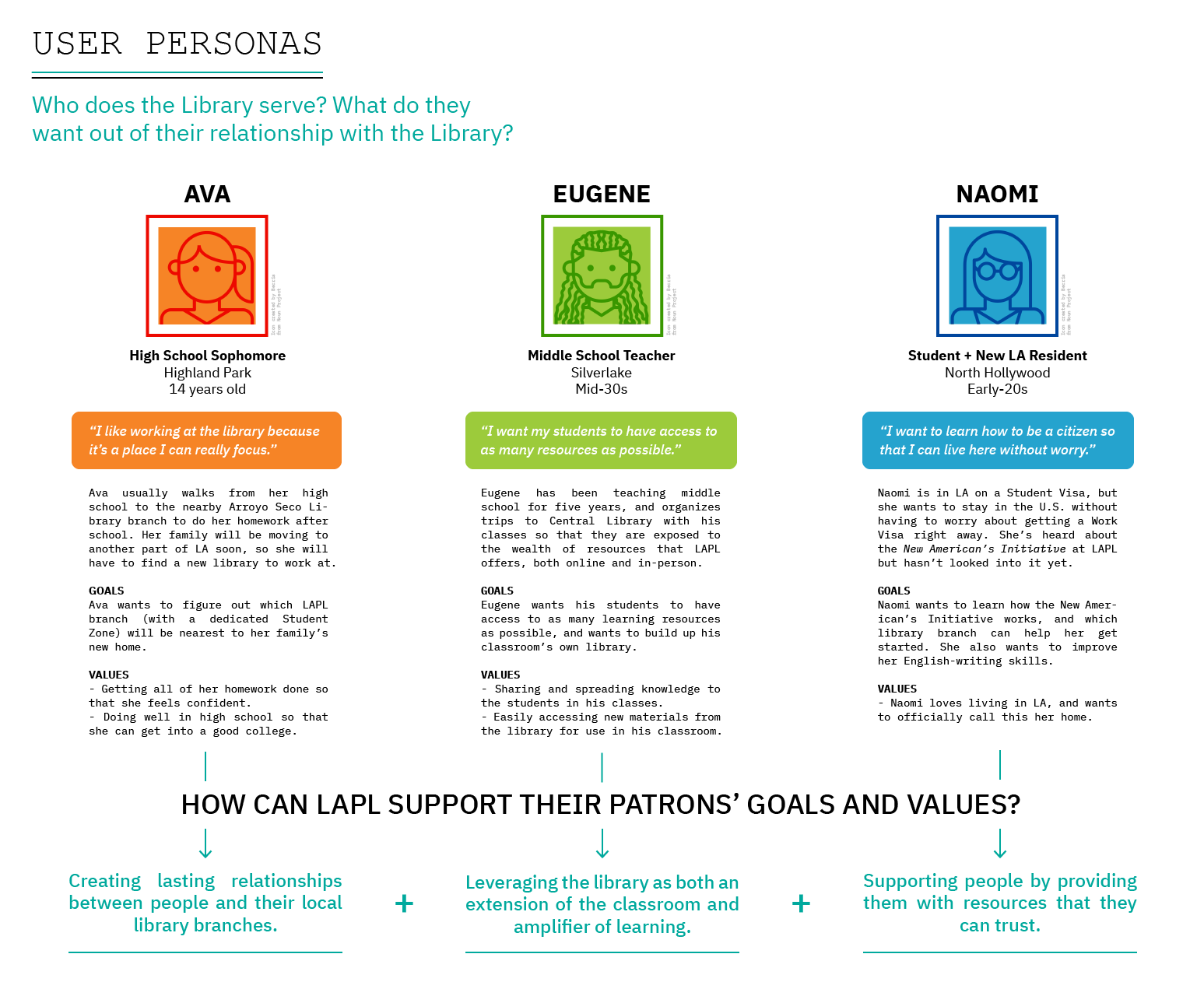
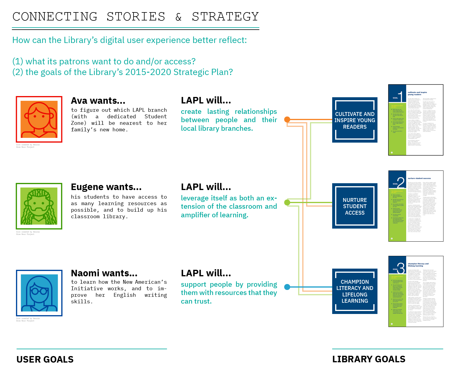
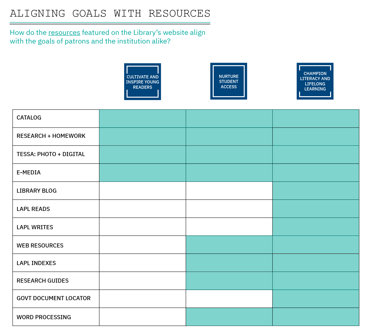
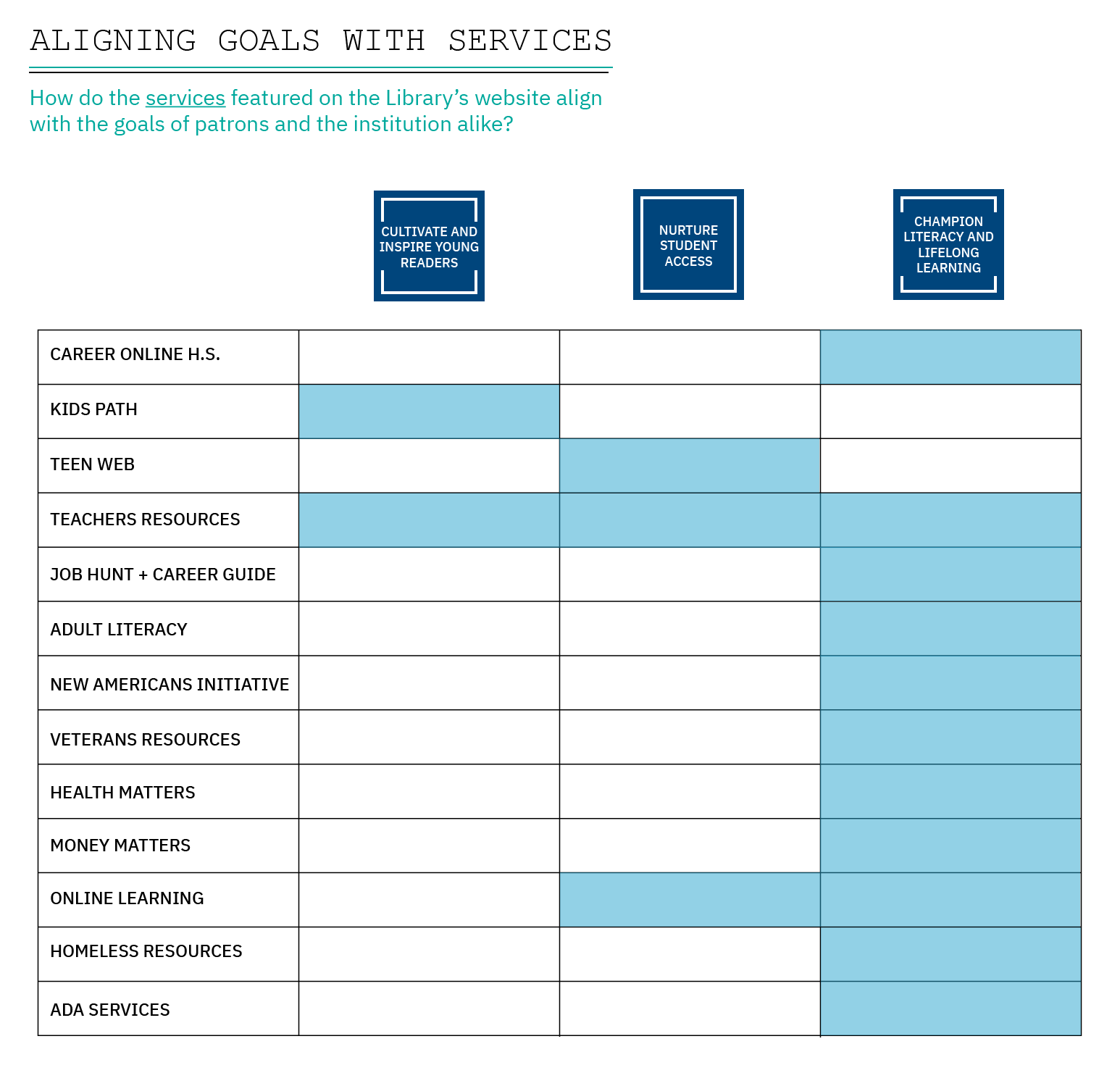
PHASE 03: USER STORIES + STRATEGY
![]()
![]()
PHASE 04A: PARTIAL CONTENT INVENTORY


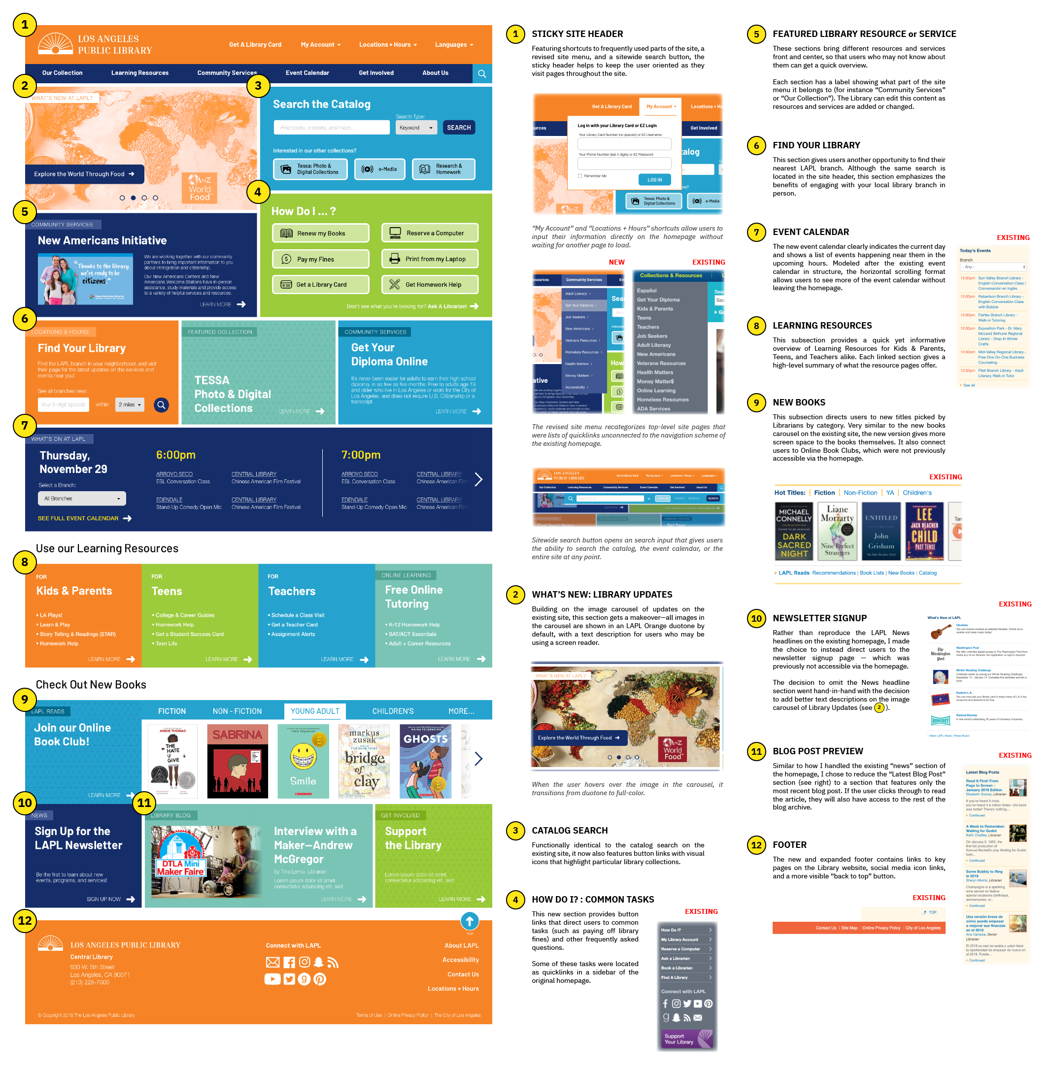
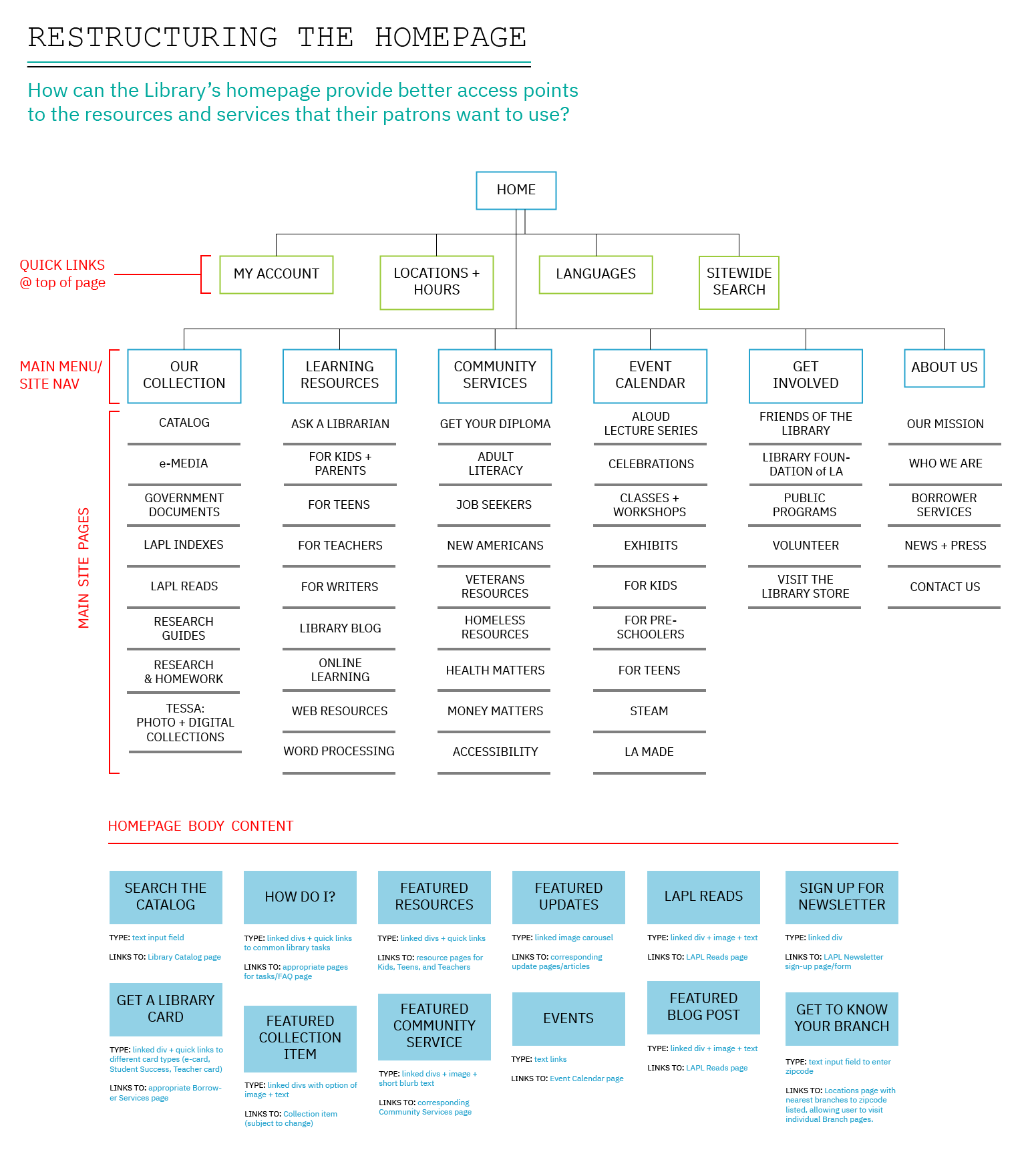
To get a broader (and more specific) sense of what content users can access from the existing LAPL homepage, I conduct a partial content inventory. I then revised how content is organized on the homepage, as well as how different pages are categorized so that only the most useful items are prominently featured on the Library’s homepage.
PHASE 04B: SKETCHING A NEW HOMEPAGE STRUCTURE
![]()
After revising LAPL’s homepage content and structure in spreadsheet form, I used diagramming and sketching to imagine what a more useful homepage content structure would be like in the abstract, for both the desktop and mobile version of the site.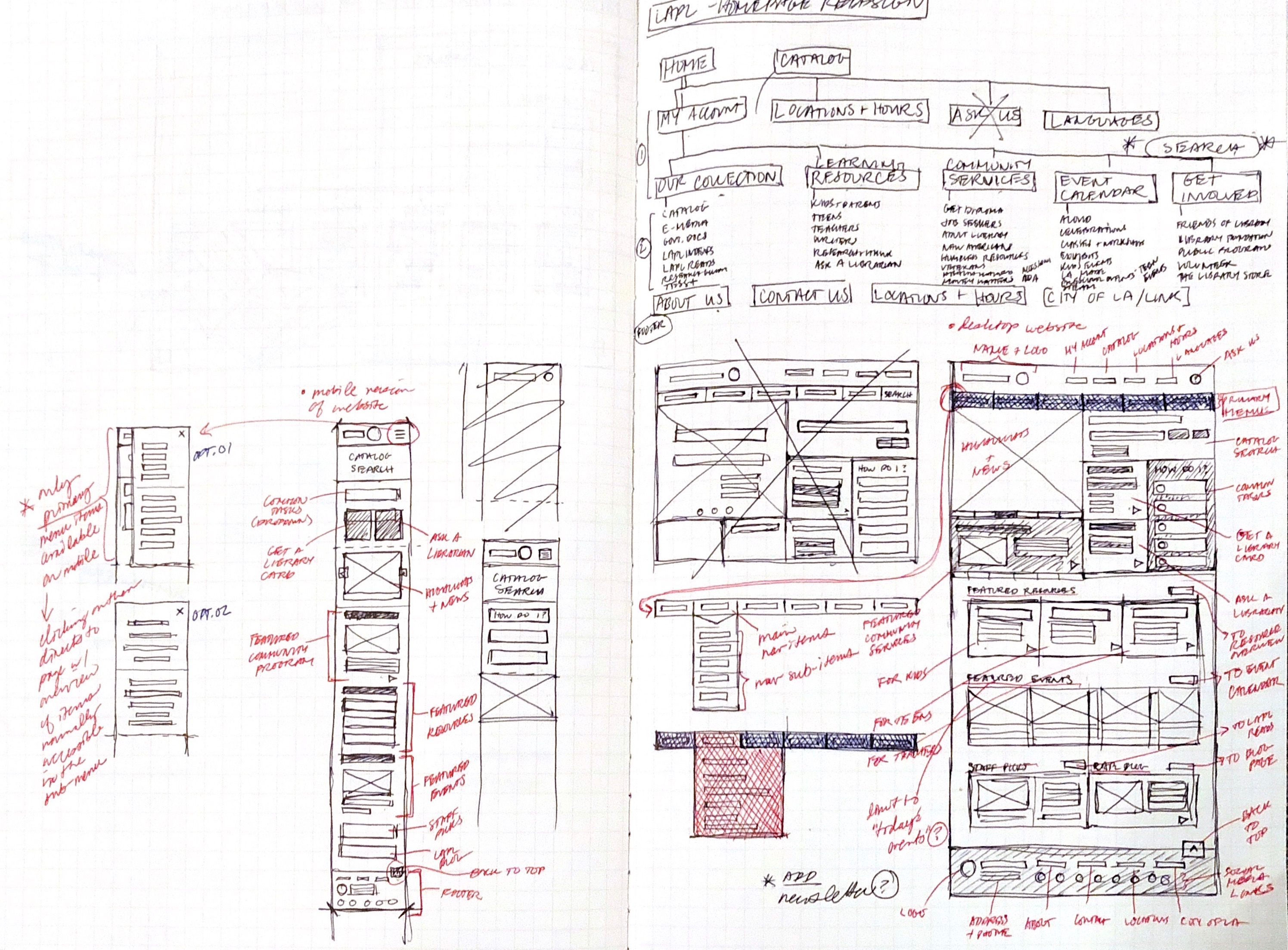
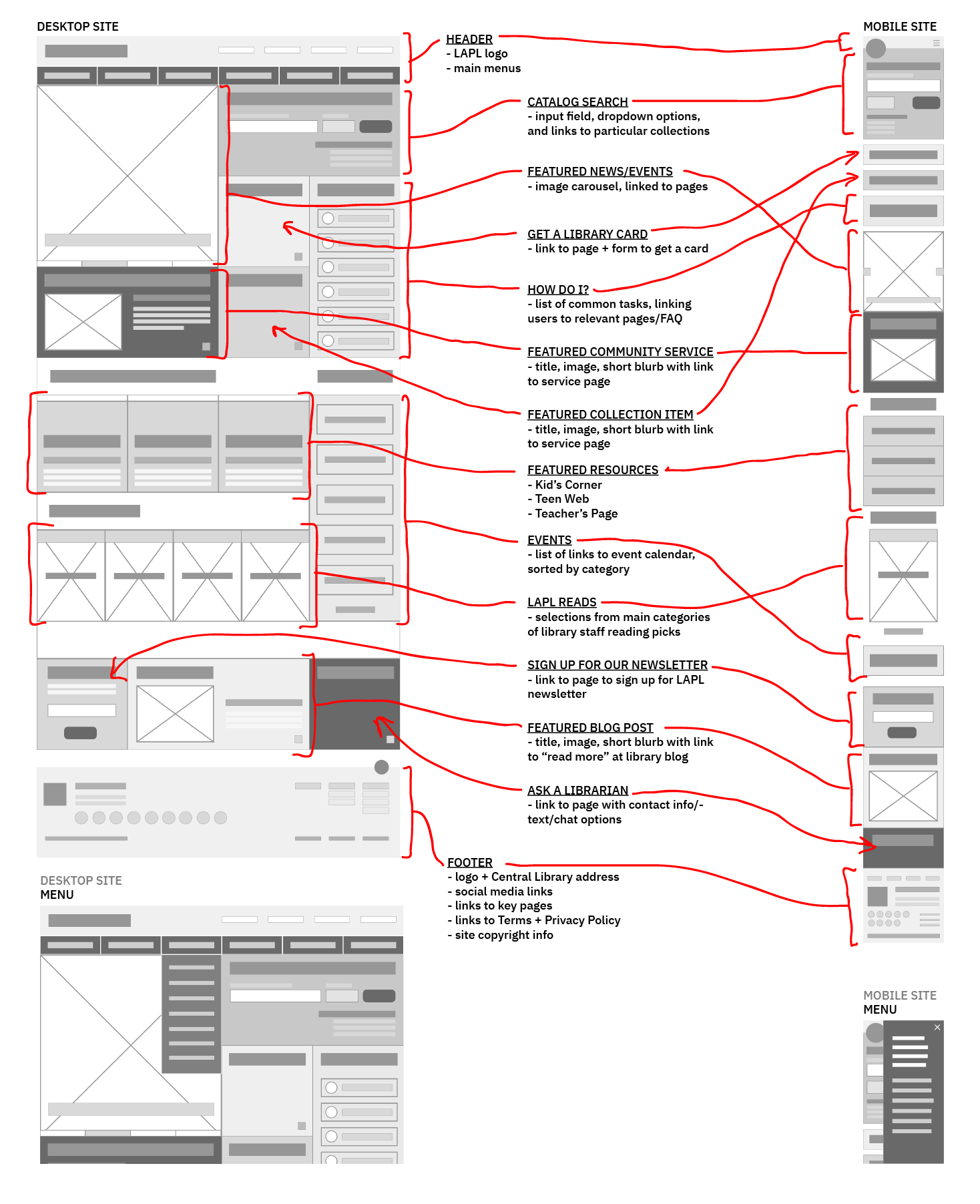
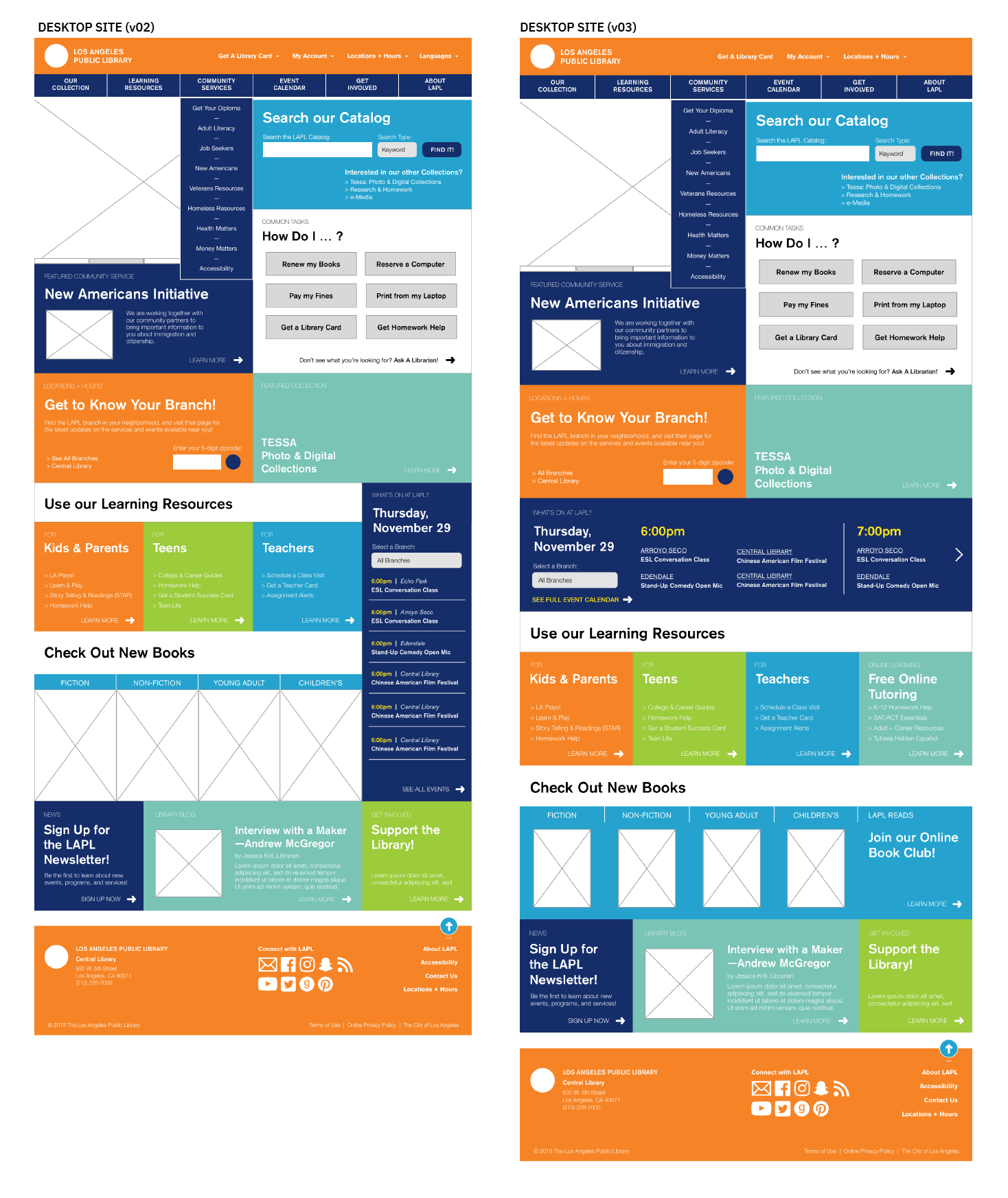
PHASE 04C: LO-FI WIREFRAMES
Using Sketch, I created the first very rough wireframes of the desktop + mobile versions of the LAPL homepage. By blocking out different page areas, and sequencing them according to what information is a priority to both the Library and their patrons, these wireframes begin to give a sense of the structural changes I am making to the homepage and its content.
These lo-fi wireframes are not set in stone, but will rather serve as a guide—a way for me to step back from the nitty gritty and get a bigger picture as I make higher fidelity mockups and build out user flows.
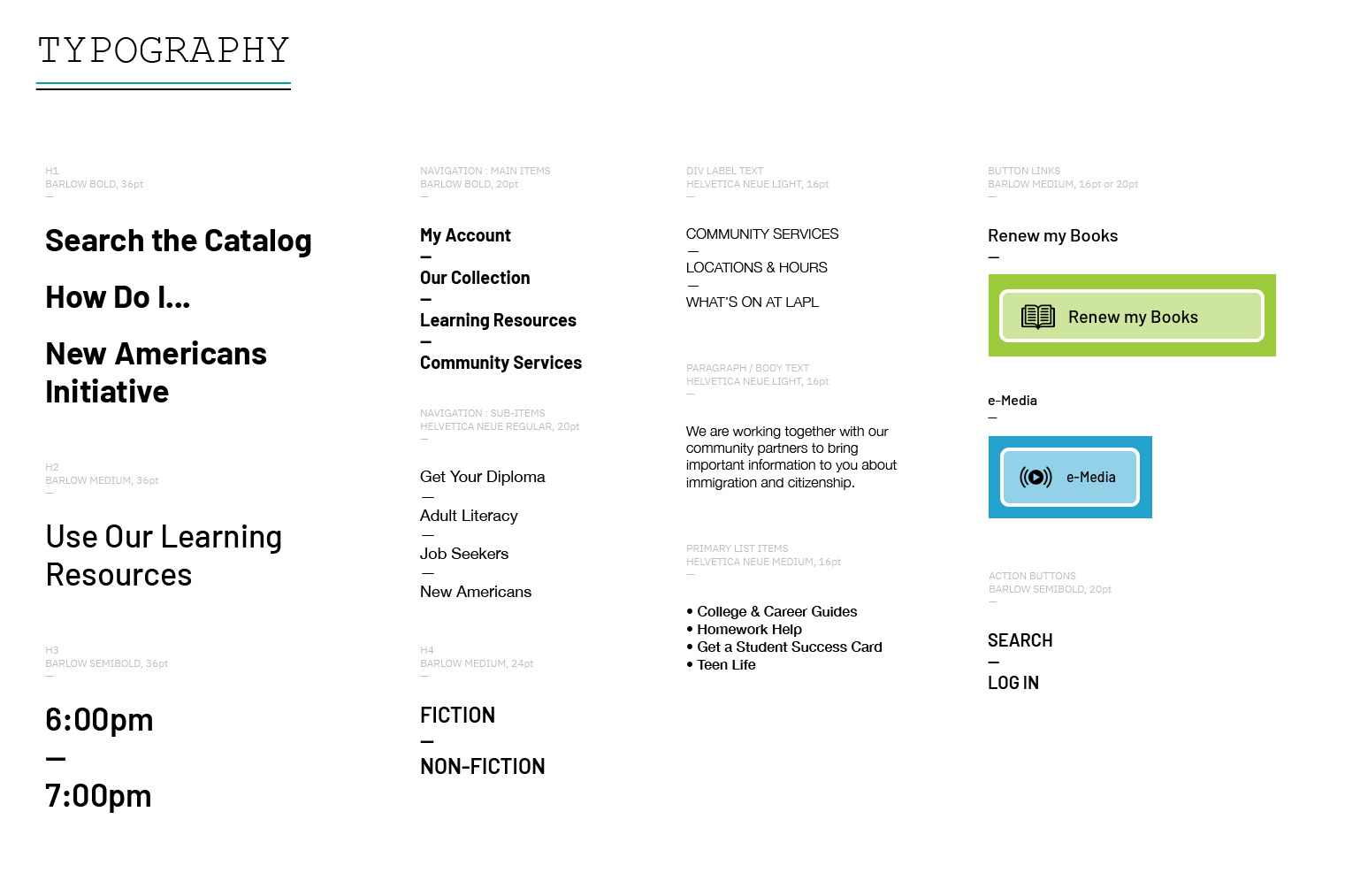
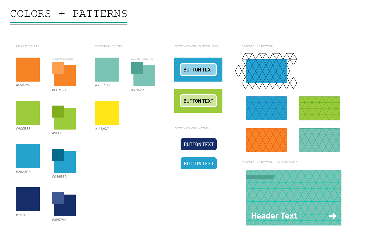
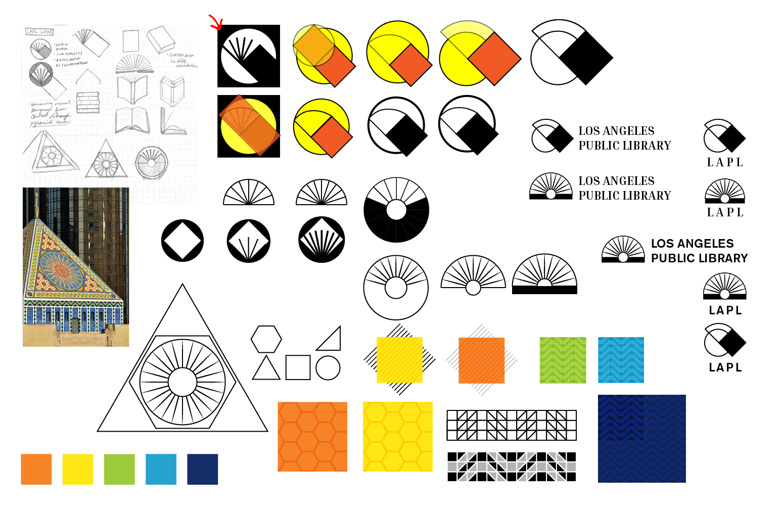
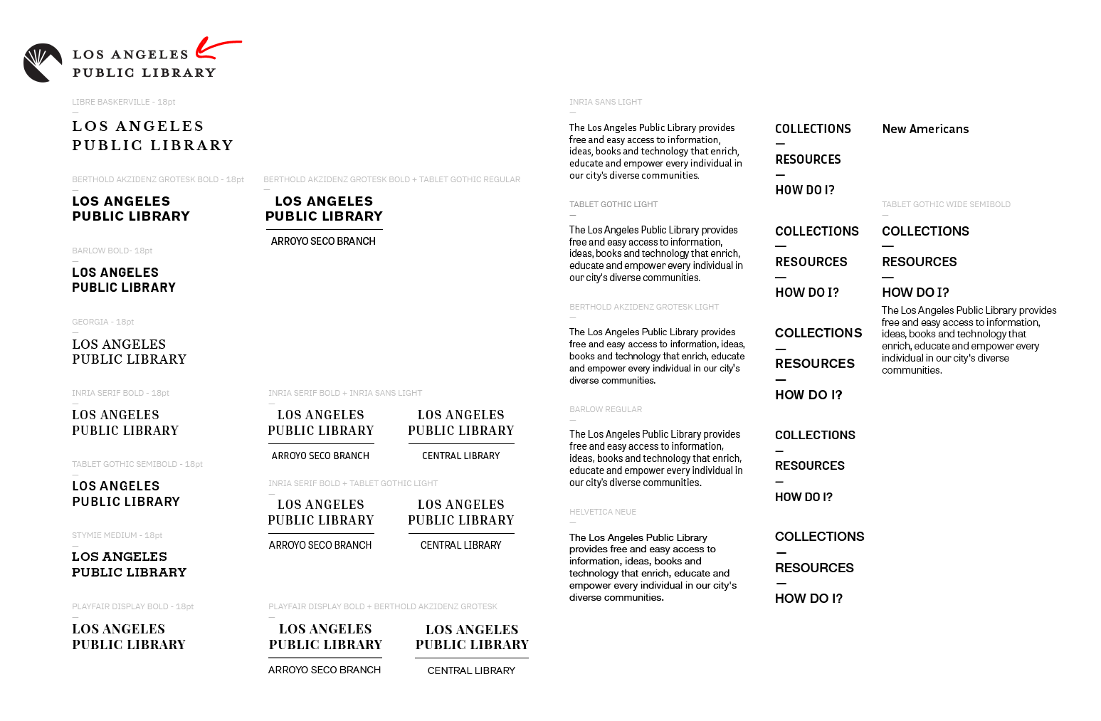
PHASE 05A: RETHINKING VISUAL STYLE
PHASE 05B: INFO ARCHITECTURE


PHASE 05C: MID-FI WIREFRAMES
Building on the initial lo-fi wireframes, I created mid-fi wireframes containing high-level content, as well as some experimentation with how the visual style could be applied to the homepage look-and-feel. The modular grid stucture is inspired by the Seattle Public Library’s homepage, but will be modified in future, higher-fidelity iterations to best accomodate LAPL’s existing content.
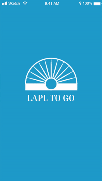
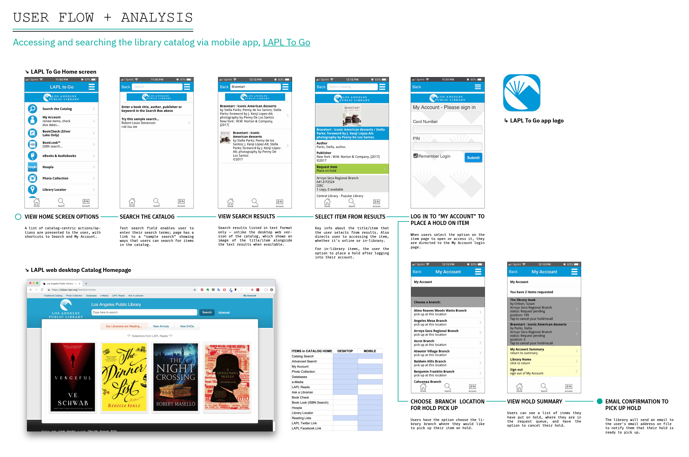
PHASE 06A: RETHINKING LAPL’s MOBILE APP
Functionally speaking, LAPL To Go (the Library’s mobile app for browsing the catalog and checking your library account) does everything that it needs to do. But as part of my LAPL homepage redesign + site strategy, it is important for me to consider how my proposed redesign would be reflected in the Library’s mobile app presence.

PHASE 06B: DEFINING THE LARGER SITE STRATEGY
Although the scope of this project is focused on the Library’s homepage, it is important to take a step back and see how the new homepage structure and style can influence that of all the other pages users can access via the homepage. While this project will not include a fully-cooked version of these other page types, it will provide an outline for how those pages could be structured, given the redesigned homepage.


